Pixel-perfect bug detection
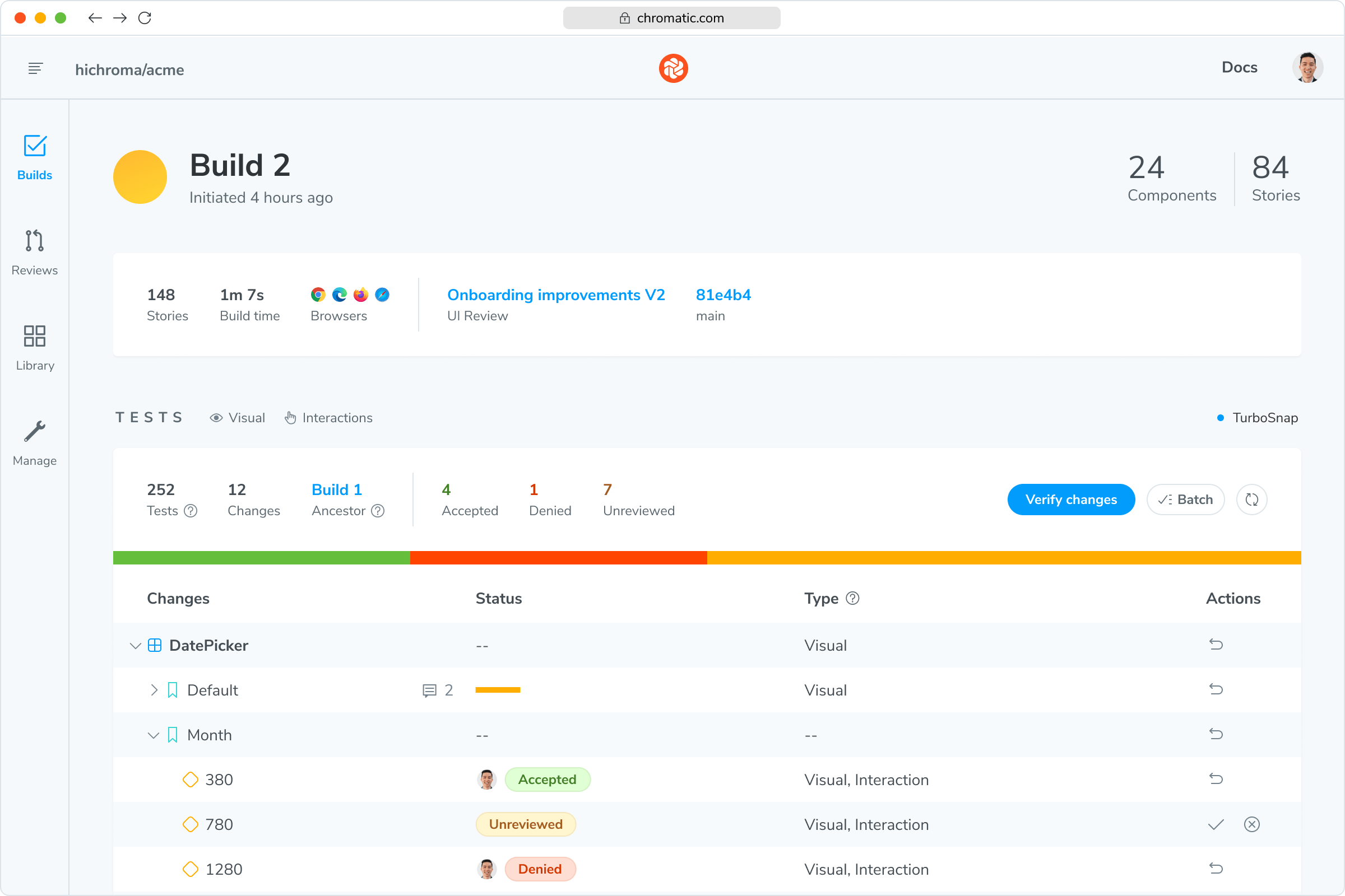
Chromatic automatically visual tests every component and page, flagging even the subtlest appearance changes. Every commit is tested in the cloud.


“Chromatic has been indispensable since the day we added it. It has really increased the confidence and speed with which we merge changes 💯”

How does visual testing work?
Visual testing scans UI changes for appearance bugs by taking a pixel-perfect snapshot of your UI, complete with styling and static assets. As you commit code, new snapshots are captured and compared to baseline snapshots.
Powered by your Storybook
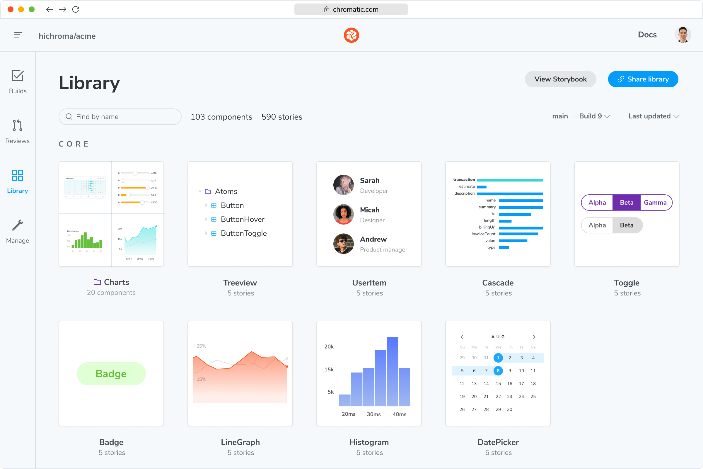
Your existing Storybook stories power Chromatic’s visual tests – no setup required. Capture all your UI states, test them automatically, and keep bugs out of your workflow. It’s that easy.

Why use Storybook? Every piece of UI is now a component. The superpower of components is that you can render a specific variation in isolation by passing in props and mocking APIs and events. Save these variations in a reproducible format called stories using Storybook.
Chromatic is built and maintained by the team behind Storybook. Together, they turn your components and pages into an powerful yet pragmatic way to develop, test, and documenting UI.
“The more things we have in Storybook, the more coverage we get in Chromatic.”

Catch every visual change
From colors to layouts, Chromatic flags even the tiniest changes in your components. Avoid accidental bugs and ship confidently, every time.
“Visual diffs make changes apparent and unmistakable... Chromatic has been extremely useful and confidence-inspiring.”

Merge without the conflicts
Review changes at a glance in Chromatic’s merge manager. Stay in the loop with instant notifications straight to Git and CI tools — no surprises.

Frequently asked questions
“I really believe Chromatic was the last missing block to really perform visual regression testing. In an era where front-end development tools got more and more visual, testing interfaces had to inherently become visual: this is Chromatic.”
