Visual Testing — the pragmatic way to test UIs
How component explorers finally allow us to test our user interfaces effectively.

Testing is integral to creating and maintaining quality software. Throughout the buildout process, you’ll often find developers and designers doing manual testing — “Does this look right?” However, due to the often subjective nature of interface design, it’s not really possible to write an automated test to capture that “correctness”. This means that companies are faced with a decision between time-consuming manual testing or the inevitable decline in UI quality that results from a lack of a proper testing regime.
The reason testing UIs is hard is that the salient details of the smallest modules of UI (components) are hard to express programmatically. When is the output of a component correct? Correctness can neither be determined by the exact sequence of HTML tags/classes nor the textual part of the output. For years, different approaches have attempted to hit the sweet-spot and capture the nuance without any real success.
This article argues for a different approach: instead of removing humans from the testing equation, let’s make use of tools to focus the manual tester on the exact components in the exact states that require human attention.
Unit testing UIs
Componentization of UIs is all the rage these days, but that is just a fancy way of saying the code is more modular.
A key benefit of modular code is the ability to unit test it.
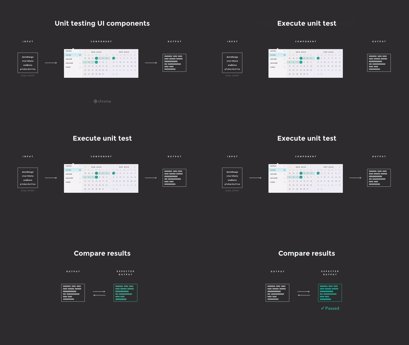
A unit test isolates a module, and then verifies its behavior over a set of inputs by comparing the module’s output on each input to an expected result. The reason unit testing is so desirable is that when testing a module in isolation (rather than the system as a whole), it is both easier to throughly cover all of its use cases, and subsequently to identify where issues are located when they occur.

The problem
For a unit of user interface (a component), we can specify the input — in React that would be the component instance’s props and context — in a straightforward fashion, but it is harder to specify the output in a sensible way that is robust to minor changes in the component’s implementation.
There are great tools (such as Enzyme) for rendering a single component in a single state, and programmatically inspecting the resulting DOM. However, in most cases, the salient details of the generated HTML are not easy to express, and the tests end up brittle (over-specified) or insufficient (under-specified).

In some cases it makes sense to write a typical unit test: if I render a RelativeDate component that should display “two weeks ago” for a given date, I can pass in a well chosen date, and inspect the text of the resultant HTML. However, even in such testable cases as this, there’s a strong argument to be made that the date formatting functionality should be factored out into a simple library, which can be then tested directly without the complexity of a rendering HTML and spelunking it for the result.
The core issue is that a large portion of components’ inherent complexity is visual — the specifics of how generated HTML and CSS appears when it reaches the user’s screen. This has historically never been easy to write a test for.
The difficulty in unit testing UIs unsurprisingly leads to a lack of UI tests, which lead to resultant regressions as UIs evolve and various states of the system are forgotten about.
It’s not surprising that you often see visual bugs in loading states or when you have unusual data even in production systems, as it’s really hard to manually test everything when deploying a new version of a UI.
In a world that’s moving toward continuous deployment, we absolutely need to test our UIs effectively; a lack of tests is a problem that’s only getting worse and worse.
Approach: Snapshot testing
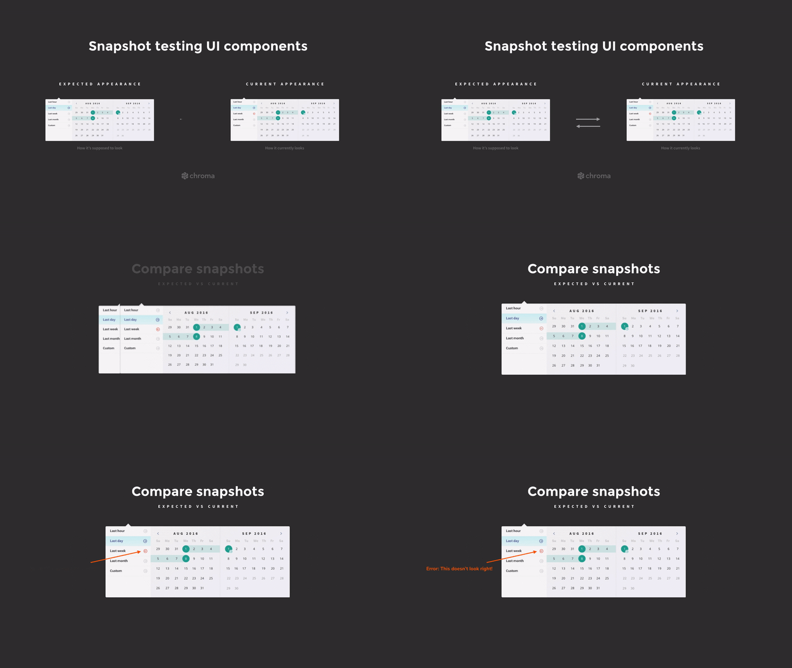
One approach to solving this problem comes in the form of a “snapshot test”. This approach complements UI unit tests by acknowledging that often UI outputs are difficult to specify in code; instead we focus on ensuring we are informed about all the parts of the UI that have changed for given set of code changes. We can take snapshots either by comparing HTML output, or by taking rendered screenshots and comparing them pixel by pixel.

This hopefully allows us to quickly check if the changes are intended — although it’s not always easy to tell that from an HTML or image diff; perhaps there’s a better way? There is! Read on.
Visual UI testing
Snapshot testing is useful, but ultimately suffers from the same brittleness as all other automated UI tests, in that tests must be constantly updated as minor details (that may not ultimately matter to the user) trigger the test to fail. Ultimately a developer must check a failing test to confirm if it is a false positive.
Snapshot testing entails an admission of defeat in capturing the essential details of a component: instead we capture them all.
There is another way, however.
A different approach to all this is to use a component explorer. The idea is that you define test states, and use the explorer to choose a state and a component and see it on the screen.
Toggling through three states of the Task component, using React Storybook
What this means is that you (a human) can very quickly and easily “run” a manual test of a component, see how it renders, and decide if it is working properly.
This may sound laborious, but typically it ends up being easier than sifting through false positives from automated tests, updating test cases to match up with minor UI changes and working overtime to make tests pass again. If you are careful to run your visual tests on a regular basis, it’s certainly a world better than having patchy or non-existent UI tests and dealing with regular regressions hitting production!
Writing visual tests
Visual tests share the same setup, execute and teardown steps as any other type of testing, but the verification step is left to the user. In React Storybook, a test is as simple an rendering a React element:
storiesOf('TaskList')
  .add('inbox', () => <TaskList tasks={inboxTasks} />);
To test TaskList in the "inbox" state, we simply browse to the relevant part of React Storybook to see it in isolation on our screen. We verify that it looks and behaves OK, and move on.
Visually testing a TaskList component with three tasks, using React Storybook
There’s one more piece of good news: there is a way to combine manual visual testing with automated snapshot testing to get the best of both worlds!
Visual snapshot testing — the best of both worlds
Visual testing and snapshot tests are similar in the fact that they both require you to list the relevant states of your component, and “test” each one.
The key difference is that because visual testing requires human intervention, it allows that human to quickly determine if the component is “working” in that state in way that simply cannot be done by examining HTML.
In terms of catching regressions, snapshot and visual testing can be great complements to each other — the changed snapshots tell you which components and states need to be visually checked; and the visual tests enable you to quickly judge if the changes are OK. Here’s what it looks like end-to-end:
How do I get started?
In principle this is possible with any Component Explorer and Snapshot testing library; let me show you how to do it with Jest and React Storybook, using the excellent StoryShots package.
Suppose you have a set of React Storybook tests (perhaps you’ve just finished our React+GraphQL tutorial series). Then follow these simple steps:
1. Install StoryShots from npm: npm install --devel storyshots (or yarn add --dev storyshots).
2. Setup an “app” test file (say in src/app.test.js if your app is based on create-react-app). Configuring StoryShots couldn’t be easier:
import initStoryshots from 'storyshots';
initStoryShots();
3. Run your tests (npm test). It should record a bunch of snapshots, one for each state of each component.
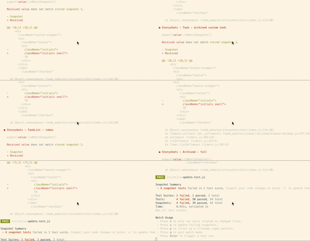
4. Alter a component, then re-run the tests. You will get a list of failing snapshots, like so:

5. Bootup Storybook and visually check each failed snapshot test. If they are all as expected, you can hit u in Jest to update the snapshots, and feel good that you’ve completely accounted for your change!
Warning to reader: this process is only as good as your stories — if you don’t have a story for a given state or component, the snapshots can’t help you. Also be aware that global CSS changes may affect components without affecting their HTML output. This is a topic we’ll cover in an upcoming post.
The above process works awesomely for Jest and React Storybook, but there is no reason that you couldn’t do the same thing for any combination of Snapshot testing tool and UI component explorer.
Don’t have time to set this up yourself? Checkout Chromatic for a plug-and-play visual testing solution made by Storybook maintainers.
Taking it further: visual test specifications
Once you’ve seen the benefits of working at the component-level and visually testing, it won’t be long until you’ll start convincing your team to join in. Things get really interesting when your design team gets involved.
Once your whole team is thinking in terms of components you can really embrace the Component-Driven Development process. If your design is specified in terms of components and states, your visual testing can reach the next level, because you know the desired visual output of a component before you build it. This enables a form of Visual Test Driven Development, a topic which I’ll cover in my next post.