Hidden in plain site — the levels of component reuse
The path to portability for UI components
Tremendous value is hidden in plain sight. All you need to capitalize on it is a keen eye. In the past, it looked like gold nuggets twinkling in shallow Sierra streams or crude oil seeping out of parched desert soil. Today, value is camouflaged in digital resources –UI components. Frontend teams can accelerate development while saving money by reusing the components they’ve already invested in building. This article illustrates the three levels of reuse found in most apps and shows you how to get the most out of your UI components.
Point of view layer
A paradigm shift is happening on the frontend. Customers expect a compelling user experience, so frontends have become more expressive but also more complex. Since HTML and CSS alone cannot handle such complexity, frontend engineers have adopted modern view layer technologies like React, Angular, or Vue. Depending on your point of view, UI components can be a byproduct or the end product of frontend development.
Byproduct
The frontend team is tasked with delivering apps and features. In the process, they also build something that has immense value. As a byproduct of using next-generation frontend tools like React they are idiomatically compelled to split UIs into discrete components — modules that produce HTML for a given set of inputs. One of the hallmark benefits of components is reuse. So in addition to an application’s essential value, the organization is also getting reusable components for free. Or should be.
End product
Let’s look at it from a different perspective. Organizations have traditionally been aligned around “app” teams — groups of people that focus on improving and maintaining one codebase. However, now that we’re all building components, that can (theoretically) be reused across codebases, the team boundaries are blurred. If we look at components as the end product of effort instead of apps, frontend teams are in the business of manufacturing components.

UI component libraries
Forward-thinking organizations are responsible for building and maintaining a component library . Teams within those organizations still assemble apps and features [out of components], but individual makers ultimately add their work to the larger component library.
A component library collates UI components from one or more apps so that they can be shared and reused throughout the company. Having a component library as the focal point of the frontend organization yields a few distinct benefits. For engineering, a library accelerates app assembly and saves money. For design, a library ensures UI consistency.
There is no such thing as a free lunch. A component library has its own set of challenges. You might think your components are automatically reusable, but in practice, they’re trapped inside the apps you build. Many are single-use; they’re chained to the specific environment of the app (often unintentionally). Most are undocumented; only their creators know how the components are intended to work.
Unlike a real library, the one with books, members can’t just “checkout” components. By using a framework like React you’ve already done most of the work to create reusable components, but some polish remains before they can spread throughout your organization. Let’s find out why by examining three component types teams encounter when building their library.

Single-use components — the most common
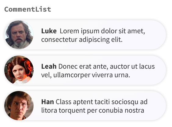
A single-use component can’t be used anywhere other than its current location. Typically, this is a result of heaping multiple concerns together into one component. For example, the CommentList React component below is responsible for fetching data and rendering HTML.

When concerns converge in one component, reuse is difficult because the surface area and level of specificity to an app’s context grows to the point of being hard to reason about. This also makes a single-use component hard to debug for other developers because they must shoulder unnecessary cognitive burden.
| // CommentList.jsx (DATA + PRESENTATION) | |
| // inspired by Michael Chan https://gist.github.com/chantastic/fc9e3853464dffdb1e3c | |
| class CommentList extends React.Component { | |
| constructor(props) { | |
| super(props); | |
| this.state = { comments: [] } | |
| } | |
| componentDidMount() { | |
| $.ajax({ | |
| url: "/my-comments.json", | |
| dataType: 'json', | |
| success: function(comments) { | |
| this.setState({comments: comments}); | |
| }.bind(this) | |
| }); | |
| } | |
| render() { | |
| return <ul> {this.state.comments.map(renderComment)} </ul>; | |
| } | |
| renderComment({avatar, author, body}) { | |
| return <li>{avatar} {author} {body}</li>; | |
| } | |
| } |
Single-use components are miniature monoliths. They’re also the most prevalent component type. As is the case in coding, developers in a hurry or early in a project can miss opportunities to generalize. The pressure to get sh!t done is formidable, but when working with components it’s sensible to consider later reuse. “Separation of concerns” is a simple pattern that you can follow to make your components easier to understand and get you on the path to reuse at the same time.

Pattern: separation of concerns
A common technique for unpacking complexity is to “separate concerns” — decompose modules into smaller, more focused submodules that divide in a way that makes them easier to understand.
This pattern has been embraced by component authors in various forms, leading to dichotomies between “presentational vs. container”[1], “pure vs. impure”, and “stateful vs. stateless” components. All of these patterns advocate splitting a component into two components — a parent and a child — where the parent (or container) renders the child, and the child is more “focused” or “pure”.
When designing for reuse, we can follow a similar pattern, by extracting the non-reusable part of the component into a parent component, leaving the “core” of the component as a reusable child component.
Break apart UIs into the smallest possible units that make sense. Separate messy data handling from appearance.
Reasons for single-use “parent” components
If you separate a component’s concerns as suggested above, you’ll find that a single-use parent component (responsible for interfacing with the app environment) is necessary for building any app. Here are a few scenarios where they’re useful:
- Putting down a link to another route
- Firing queries or mutations off to a server
- Dispatching or getting data out of a global store
- Rendering any sub-components that do one of the above (reliance on the environment passes up the component hierarchy)

Reusable components — an achievable goal
A reusable component does not rely on anything from the environment it renders in. It renders exclusively based on its inputs and internal state because there is a clear delineation of presentation and data. If the input data provided to a reusable component changes so too does the resultant visual representation.
A reusable component relies on standard input API (props, scope, arguments depending on the view layer) to pass in any data the component needs. It then declaratively reconfigures itself depending on that data. For instance, if you need to render a link pass the URL in as an input. If you need data pass it in as an input. If you need to submit a form or fire a mutation, pass a callback or event handler in as an input.
When there is standardization of inputs and outputs, components can enjoy wide reuse in an app with any data. Not only is the pattern beneficial for reuse, it’s widely adopted best practice for creating components that are simple to test and easy to reason about.
For example
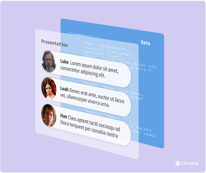
Let’s see how this might work in practice. The single-use CommentList example earlier showcased a component whose presentation and data requirements were intertwined. To transform CommentList into a reusable component we’ll need to divorce presentation from data. Given the comments data comes from the environment (the server in this case), we’ll split the reusable part from the non-reusable part so that a variety of data can be rendered.
Presentation: what it looks like
| // CommentList.jsx (PRESENTATION) | |
| class CommentList extends React.Component { | |
| constructor(props) { | |
| super(props); | |
| } | |
| render() { | |
| return <ul> {this.props.comments.map(renderComment)} </ul>; | |
| } | |
| renderComment({avatar, author, body}) { | |
| return <li>{avatar} {author} {body}</li>; | |
| } | |
| } |
Data: what information it displays
| // CommentListContainer.jsx (DATA) | |
| class CommentListContainer extends React.Component { | |
| constructor() { | |
| super(); | |
| this.state = { comments: [] } | |
| } | |
| componentDidMount() { | |
| $.ajax({ | |
| url: "/my-comments.json", | |
| dataType: 'json', | |
| success: function(comments) { | |
| this.setState({comments: comments}); | |
| }.bind(this) | |
| }); | |
| } | |
| render() { | |
| return <CommentList comments={this.state.comments} />; | |
| } | |
| } |
Ergonomics increase reuse
We’ve seen that in order to transition from single-use to reusable components, teams must overcome a technical challenge by separating component concerns. To encourage wide component reuse, teams must face a usability challenge by improving component ergonomics.
Ergonomics are the design characteristics of an object that allow for efficient and safe interaction.
Component reusability can be a double-edged sword. Each input to a component may take a potentially infinite set of values. While greater flexibility supports more situations, it also increases complexity because there are more permutations to design and document. If fellow developers want to reuse your work they must overcome the hopeless task of spotting how a component is intended to be used from seemingly infinite input variations. In order to increase usability make your component easy to understand.

Portable components — the promised land
A portable component separates presentation from data, can exist independent of its environment, and documents which states are used by that component. When a component is portable, it is packaged in such a way that other developers can easily use.
The difference between a reusable and portable component is the usage documentation.
State is the intersection of design and frontend development. In design, state is the specification of how a component should look for given inputs (data, viewport, etc.). In development, state describes the specific value of inputs that result in a given appearance.
Documenting state, the expected appearance given typical inputs, is a lightweight way to express how a component is supposed to be used for your design and development compatriots. It’s a practical compromise between documenting all possible component inputs (more work for the author) and not providing usage examples at all (more work for the consumer). So how do you create a portable component? Let’s find out.
UI component explorers –your new best friend
Think of component explorers as a window into UI component states. A component explorer is an application that lives parallel to your production app that showcases your UI components in various test states. In this case, a state is essentially a visual test case or specification — a set of typical inputs to that component.

Component explorers help engineers build modular UI’s by visualizing components so that they can be constructed in isolation of app logic. They allow you to simulate component states for testing and serve to index your app’s UI components for later reuse.
Using a component explorer
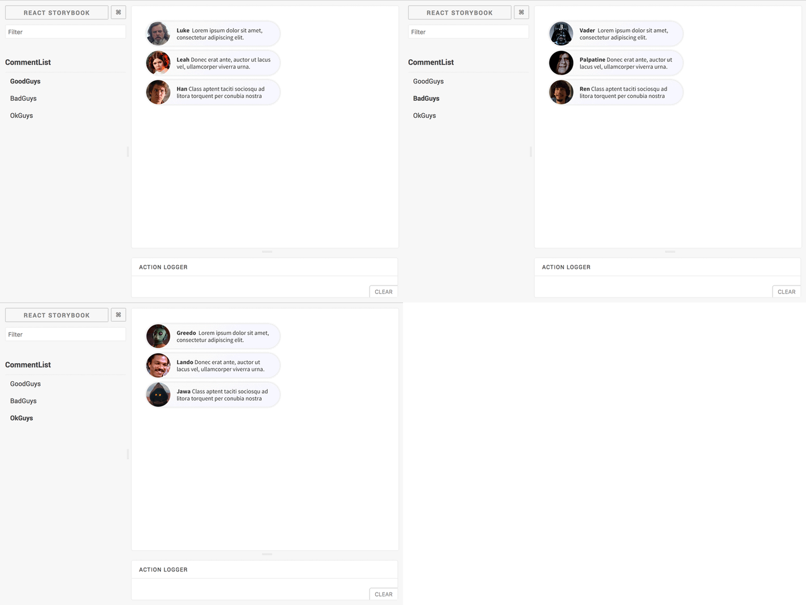
You would use a component explorer when constructing a portable component to define and test various states. Your team would also use one to “explore” the supported states of a component to see how they might use your component. Here’s how CommentList would look with test states for GoodGuys, BadGuys, and OkGuys in a component explorer:

Putting it all together
Portability is the ability to browse expected states of a reusable component via a component explorer. Creating reusable components does not alone ensure that they’ll be utilized by others. By expressing a component’s typical or expected usage via state, we provide a guide for our team to build more consistent UIs and save time.
Learn more about component explorers
UI component explorers –what they are
Component-Driven Development–how to use them
Destiny
UI components were always intended for mass consumption. Their conceptual lineage traces back decades to computer science first principles and centuries to the birth of industrial manufacturing.
In this article we’ve covered three common patterns teams encounter when building componentized frontends: single-use, reusable, and portable components. Each pattern has its right place. Being vigilant about opportunities to reuse components and designing for portability from the get-go will allow you to capitalize on tremendous value hidden in plain sight.
[1] Note: Dan Abramov’s presentational/container component split does not map one-to-one to the single-use/reusable split I’m discussing here. While a presentational component is typically well-suited for reuse and a container component is often too intertwined with its environment for reuse, it is sometimes possible to reuse a well-designed container component (especially within the same app). However, the reliance of container on its environment, e.g., the presence of a particular key in the global Redux store, will always constrain the wider shareability of that component.
Code samples inspired by Michael Chan’s gist 👏