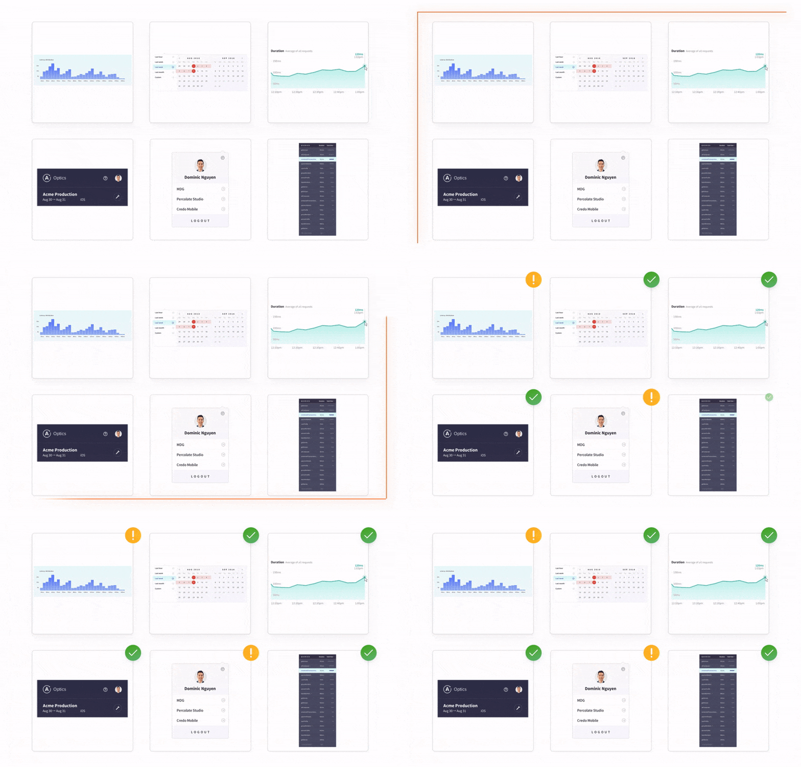
Chromatic 1.0 — continuous UI testing for React
Automatic visual testing for UI components and libraries
TLDR: We’re launching Chromatic 1.0 today! Chromatic monitors the look of React UI components from commit-to-commit and notifies you of visual changes automatically. You save time by automating visual QA. You save money by avoiding expensive bug fixes. Made for Storybook by Storybook maintainers.
User interfaces can be awkward to test. Developers cycle through the same tired questions: Does this look right? What changed? How did this pass QA?
For years, different approaches tried to test UI details programmatically without much success. Glancing over a teammate’s shoulder remains the quickest way to check if a design looks right.
But manual UI testing is absurd. Production apps have too many edge cases for it to be economical –much less enjoyable. Most teams end up testing a few core use cases and stomaching the flood of regressions elsewhere. And as app complexity grows the regressions are only getting worse.
There’s a better way. I’m thrilled to announce Chromatic 1.0, a continuous UI testing tool that combines the accuracy of manual testing with the efficiency of automation. Read on for details.

UI bugs are insanely expensive
The average developer spends up to 21% of their time fixing software bugs. Let that sink in. 8 hours. Each week.
If you build UIs for a living like me, you’ve wasted countless hours fixing bugs. You may have tried to automate UI testing but the reality is that visual tests are often absent from development workflows because effective tools didn’t exist (until now).
What’s more, UI bugs will soon cost even more time and money. Emergent frontend best practices mean that the majority of software bugs will shift to the view layer and each bug will have an outsized impact on the UI.
“Heavy” frontends make debugging harder
Frontend complexity is skyrocketing. Reusable APIs combined with trends toward personalization, state on the client, and responsiveness result in more frontend business logic. This means developers have a greater chance to introduce more defects that are time consuming to debug.
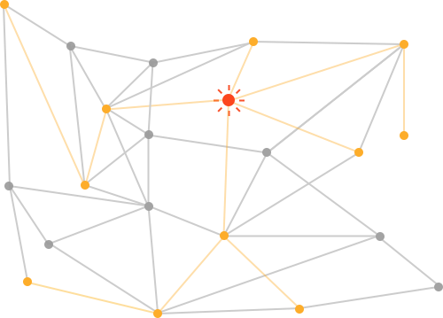
Components result in chain reactions that spread bugs
Modern view layers make it easy to build complex UIs from simple components. But the component construct that enables these benefits also increases the likelihood of spreading defects.
Continuous delivery makes it too easy to deploy bugs
The shift to continuous integration and delivery is undeniable. Developers love automating the build-test pipeline and being able to ship faster. But this serves to shorten the visual QA time window making it easier to deploy UI regressions by accident.
In modern UIs minor changes can trigger widespread bugs that are hard to discover and quick to deploy.
A better way to test UIs
My team and I surveyed hundreds of developers from companies like Priceline, Auth0, and Apollo during Chromatic’s private beta. Our big realization was that all people really want is to build beautiful UIs and not worry about the rest.
No one enjoys writing fragile UI tests, manual visual QA, or fixing regressions in production.
Imagine a world where you build UI components and get automated visual tests for free. Consider a workflow where you instantly knew the impact of code tweaks on your UI.

If you could continuously monitor visual changes, you’d be able to detect UI regressions as soon as they happen. This would help your team pinpoint and fix UI bugs in development –long before users ever encountered them in production. You could deliver bulletproof UIs while also saving time.

Introducing continuous UI testing for React
Developers already automate testing throughout the stack. So why do we continue to suffer through manual visual QA or co-opt prehistoric tools to test modern UIs?
Tom, Zoltan, and I set out to build a continuous UI testing tool made for modern view layers like React. Chromatic automates visual QA for the basic UI building blocks: components.
Testing at the component-level helps pinpoint the cause of UI regressions (much like unit tests) while avoiding false-positives that page-level tools fall victim to.

Yes, this means you can finally say goodbye to mind-numbing manual visual QA.
With Chromatic, tests are auto-generated from Storybook and run in the cloud whenever you push code. You get notified of visual changes via pull request and CI so you can ship UIs with confidence. Read on to see how it all works.
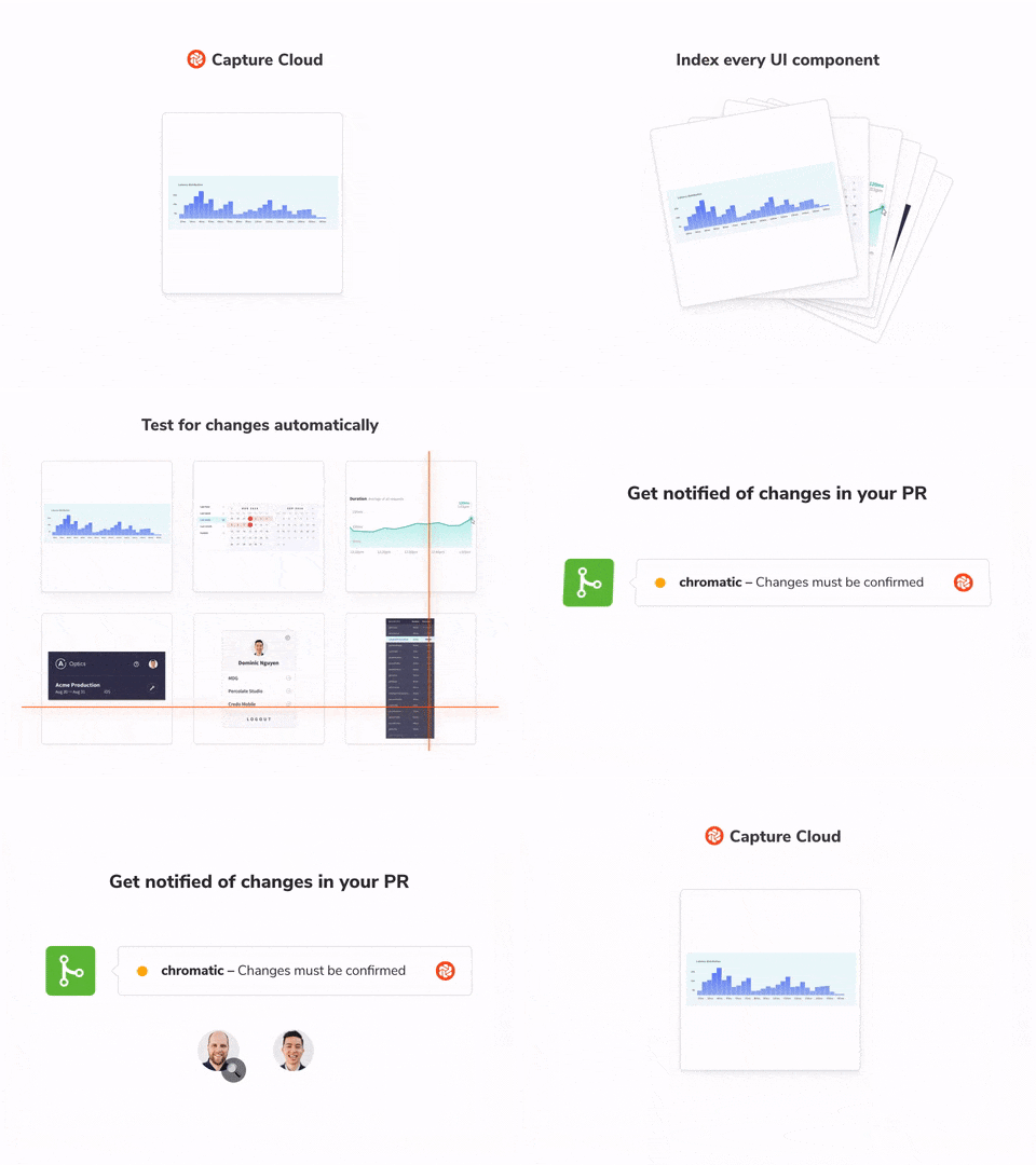
📸 Capture Cloud
Chromatic is a Storybook addon that visually tests your components in the cloud whenever you push code. It supports React, Vue, Angular and everything Storybook.
Code, styling, and assets for each component render on-demand in a controlled browser environment and then snapshotted. Snapshots are anchored to the commit and branch to make comparison precise.
Tests are lightning fast. There are no worker queues or concurrency bottlenecks. Your tests run as fast as possible. In practice, our parallelized infrastructure means hundreds, even thousands of stories are tested in a minute or two.
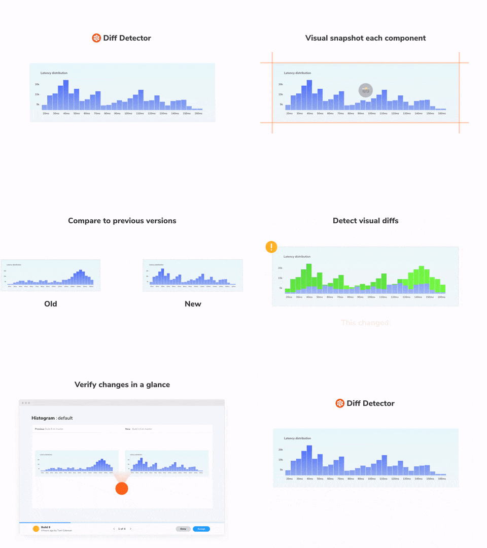
🔍 Diff Detector
Components changes are found by comparing the latest snapshot to a baseline –the last known “good” state of a story– down to the pixel. When changes are detected you get notified in a pull request or email.
View changes in the Chromatic app through three different perspectives (one at a time, side-by-side, diff) that each highlight visual diffs in a unique way. Code diffs are also sourced from the rendered UI to help you track down changes to the DOM element.
Want to deep dive into the look and feel? Reproductions are dead simple because the real code, styling, and assets are indexed alongside the visual snapshot each commit. This means you can inspect code or rewind a component to anytime in history.
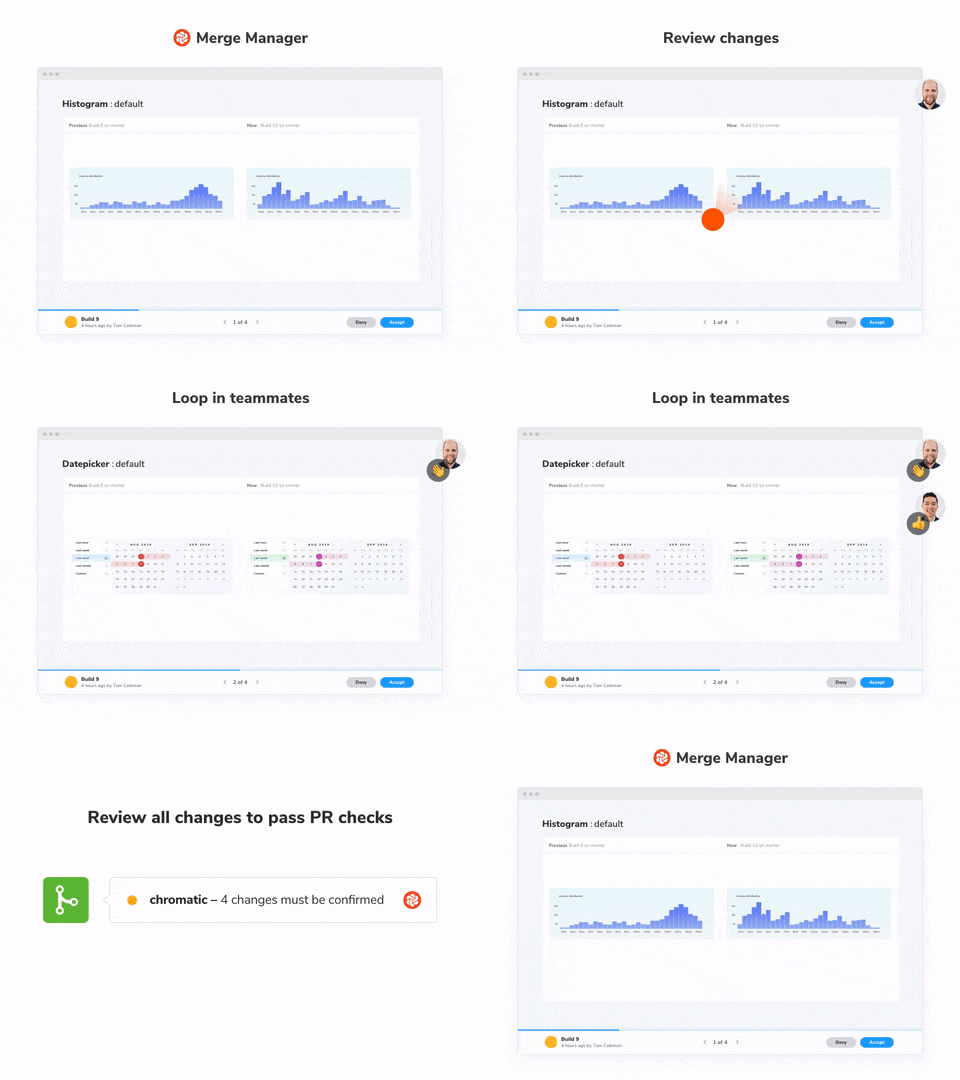
✅ Merge Manager
“I love maintaining tests” said no one ever. Chromatic tests self heal. When you accept a snapshot you update the visual baseline which is carried over to future tests. As your team accepts snapshots your UI tests naturally evolve in tandem with the components.
Chromatic understands Git. Once a snapshot is accepted in Chromatic, it won’t need to be re-accepted until it changes, even through git branches, and merges.
Collaboration is a core part of the Chromatic workflow. Sync account permissions and access with GitHub, Bitbucket, or GitLab in 1-click. This allows you quickly loop in key stakeholders to get a second pair of eyes.
“I love maintaining tests”… said no one ever
Chromatic is your shared source of truth
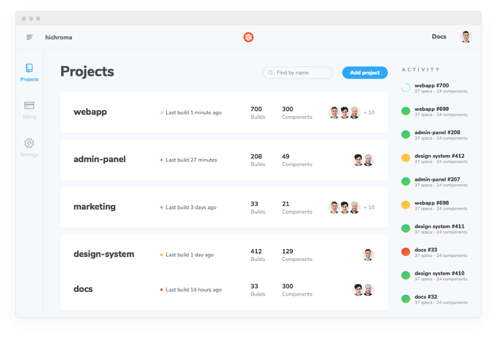
It takes a team to build a production UI. Like you, we understand that communication breaks down as team and scope grow. That’s why we also generate a universal reference point for teams: the component library.
Every project in Chromatic has a corresponding online component library. The library is complete with each component’s code and visual baseline across commits and branches. This gives your team one shared place to reference any component you’ve ever made.
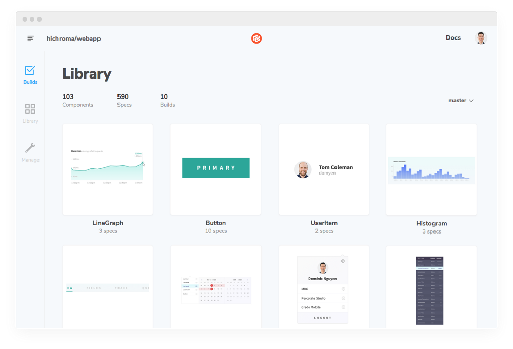
Component libraries help you do more
That’s not all. Component libraries are an untapped opportunity for teams to save even more time and money. Reusing components can deliver a 40–80% productivity boost.

Continuous UI testing with Chromatic helps you harden components. The component library helps you discover and reuse those same components to build UIs more efficiently.

Say bye to UI bugs for good
Developers shouldn’t have to choose between tedious manual QA and costly UI bugs. UI testing should be a continuous part of your development workflow just like the rest of your test suite.
With Chromatic you can say bye to UI bugs, save time, and ship bulletproof components faster. Sign up for your 30-day free trial now.
👉 Learn more about Chromatic here👈

Frequently asked questions
Does Chromatic work with Storybook?
Yes, Chromatic was made for Storybook by Storybook maintainers. Our integration is airtight. It also works without Storybook via the Runtime API.
Is Chromatic only for React?
Nope. Chromatic also works with Vue, Angular, Polymer, raw HTML, Mithril, MarkoJS, and pretty much everything Storybook supports.
Why test components in webapps vs pages?
Page-level testing is not great for componentized UIs. Components are reused across many pages. If a component changes, it often triggers noisy test failures on every page it’s used. These are false positives because they don’t tell you what caused the change.
Visual testing at the component-level makes it easier to scope tests and identify regressions. The component construct is key to making continuous UI testing more precise and less brittle. Chromatic is the only tool designed for UI components.
What’s so great about testing in the cloud?
Speed, collaboration, and consistency. The cloud enables massive parallelization, opens the door to a collaborative online review flow, and gives us a consistent browser environment to render your components.
Local tests are slow — even for small component libraries. They’re inconsistent because everyones development environment is different. And collaborating on review is impossible because tests run on only one machine. In short they’re unideal for productive teams working on critical apps.
How does this compare to open source tools?
Open source libraries are free, and free is attractive. Chromatic builds upon open source best practices (we contribute to OSS too) and offers work saving features for professional developers like cloud performance, online collaboration, zero-config branching, painless merging, a component library, and many more features out of the box.
Does this replace Selenium or Cypress?
Chromatic complements end-to-end(E2E) testing tools like Selenium and Cypress. E2E tests are great for QAing the “happy path”, but are tricky to create and require a lot of maintenance. They end up being poor value for visual test coverage. Chromatic gives you expansive UI coverage without having to write more tests.
How does this compare to Jest and Enzyme?
Jest and Enzyme tests are great for testing app functionality but don’t cover the rendered UI. Chromatic is built to detect visual regressions. Jest, Enzyme, and Chromatic are complementary.
Isn’t this just snapshot testing?
Nope, it’s different. Snapshot testing captures your component’s rendered code. We capture the rendered appearance. This is important because:
- The way the browser renders UI is also determined by styling and assets such as images. Unlike code snapshots, Chromatic renders the UI in a browser to capture an image of what users actually see.
- Changes are not necessarily “failures”. Discerning intentional UI changes from bugs is hard when all you have is a markup diff. We help you visualize, review, and merge UI changes.
- Code changes don’t always result in UI changes. Code snapshot tests only identify changes in code. This ends up generating a flood of false positives. Chromatic does not have this problem.
Who are you?
Chromatic is Tom Coleman, Zoltan Olah, and Dominic Nguyen. Currently, our team also helps maintain the most popular component explorer Storybook. Previously, we helped design and engineer the widely-loved open source Apollo GraphQL toolchain and JavaScript framework Meteor. Before that, we ran a boutique frontend agency that consulted with companies like Apple, Havas, and Yummly.
Do you sponsor open source projects?
Yes. Qualifying open source component libraries get free usage! Submit your project by writing to us via in-app chat or tweet @hi_chroma.