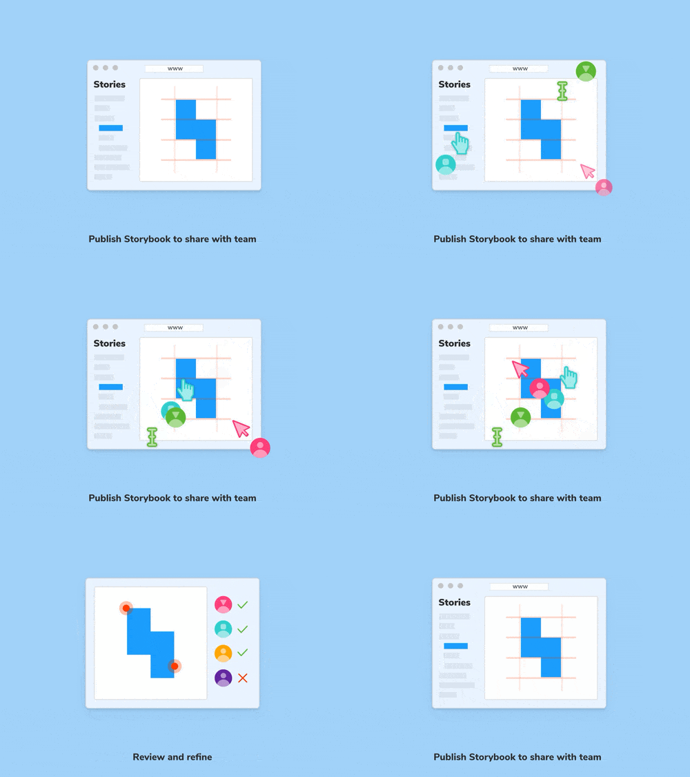
Assign reviewers for visual review
Chromatic 2.0 Early Access update
Chromatic 2.0 Early Access update
UI engineering is a team sport. It requires careful coordination amongst developers, designers, and product managers. But juggling expectations for stakeholders is tricky because everyone has an opinion and works differently.
You end up spending more time wrangling teammates, pestering them for feedback, and responding to comments than actually building UI. Chromatic 2.0 (available in Early Access) makes requesting feedback from stakeholders an explicit and integrated part of your UI review process.
Sign up Chromatic 2.0 Early Access below!
Chromatic 2.0 introduces a new workflow called visual review. It’s like code review, but for user interfaces. Visual review complements your existing code review process and helps you refine UI implementation with feedback from your team.
Assign reviewers
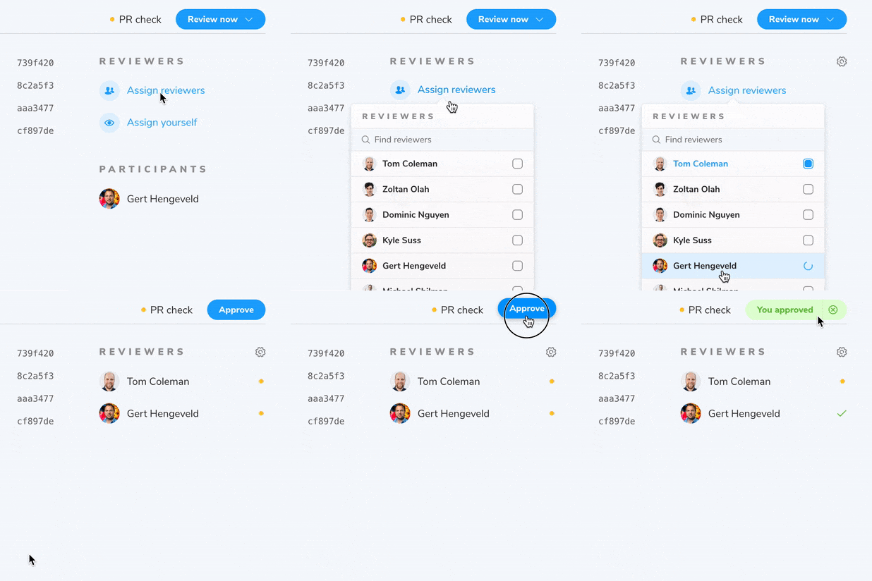
Chromatic keeps stakeholders engaged and on track so UI developers can merge faster. You can now assign teammates to give you feedback on your work and approve finished UI. Let’s see how it all works below.
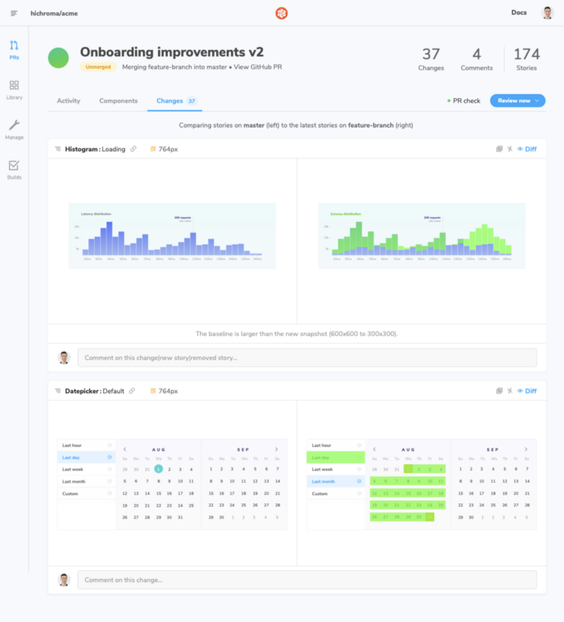
1 Every time you create a pull request, Chromatic scans for new or updated UI. It compares the UI components from your feature branch to the target branch to visualize the impact of incoming UI.
2Developers, designers, and PMs can quickly focus their attention on the work in progress (i.e., only the UI that has changed). Stakeholders can request changes or ask questions by starting a discussion.
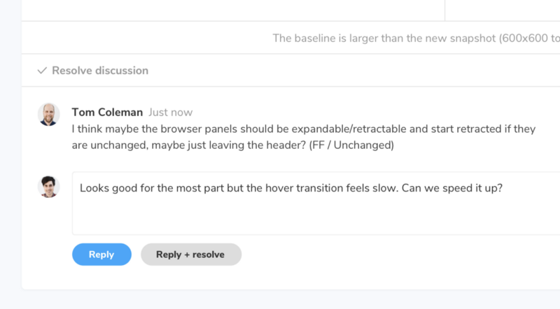
Every discussion is consolidated on the PR activity feed. This helps teams keep track of progress and gives you a paper trail of past UI decisions.
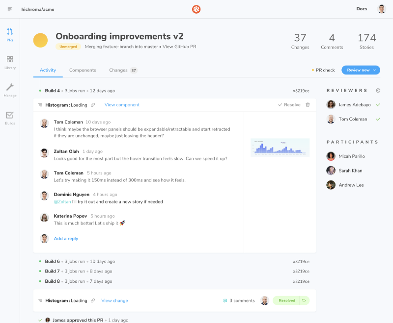
3 Request feedback by assigning teammates in the sidebar. That will ensure the PR check remains 🌕 “Pending” until the PR has been reviewed.
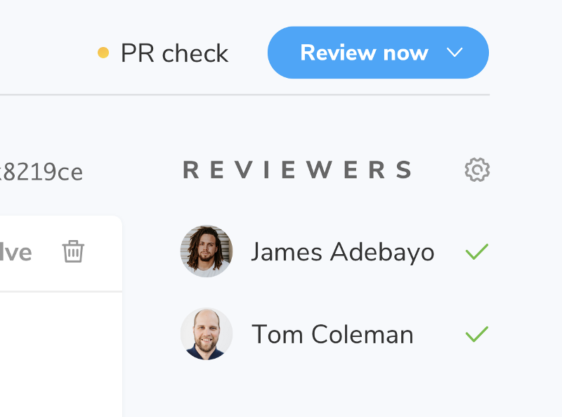
Chromatic will update the PR badge in GitHub, Bitbucket, or Gitlab to reflect the state of visual review. That keeps your more technical teammates in the loop of UI progress.

UI checklist for progress tracking
I’m particularly thrilled about the UI checklist in Chromatic. If you develop UIs for a living, you often encounter situations where it’s unclear how to move forward with merging a PR.
“Is that comment a blocker?”
“Did they approve the code… or the look and feel?”
“Who else needs to see this before shipping?”
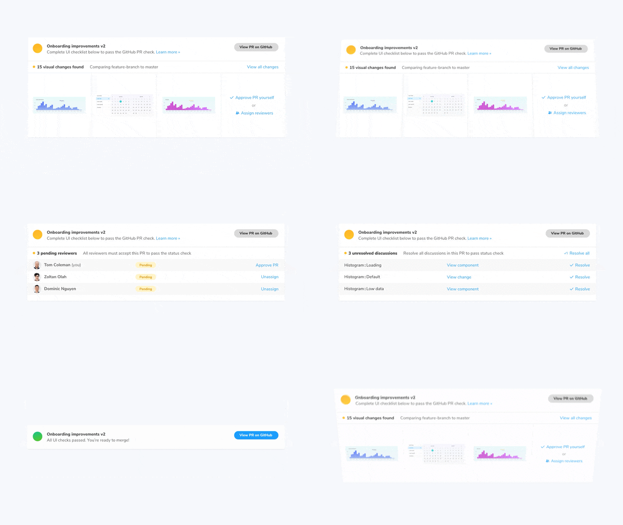
The UI checklist shows you outstanding discussions, pending reviewers, and code errors that need to be resolved before merging. That way, you get certainty that the UI in a pull request is ready for production before merging.
What’s next?
At Chromatic, we believe teamwork shouldn’t add more work. We’re focusing on streamlining UI collaboration with tighter, more intuitive integrations into your existing CI workflow.
Learn more about Chromatic 2.0
Chromatic 2.0 introduces a secure collaborative workspace for Storybook made for professional frontend teams. It complements Chromatic’s industrial-grade visual testing workflow already used by BBC, Workday, and Adobe. Learn more here and sign up for Early Access below.